The most important design philosophy is to deliver the information clearly and quickly to the audience. Infographic design help the audience have a quick overview of the topic and catch the key point.
I used an infographic template from Canva, and I chose this template because it is well organized. Alignment and hierarchy will achieve a clear structure and provide a better user experience. This design delivers the information step-by-step and looks like a study map.
Besides, the primary colors are dark and light green, which apply to the design principle of balance. It will help the audience understand the content easily through dark and light green balance. The repetition of green signs also helps tie the design and overall look together.
I apply the principle of proximity to this infographic. Infographic elements next to the dialog box are relevant to the context. Combining images and words can I apply the principle of proximity to this infographic. Infographic elements next to the dialog box are relevant to the context. Combining images and words can enhance the audience’s interest and memory.
Indeed, white space is essential for an infographic. Infographics can help the presenter to describe his story better. However, too much text and elements can cause visual fatigue for the viewer, who will lose interest in the story. Therefore, there should be a break between the features and content.
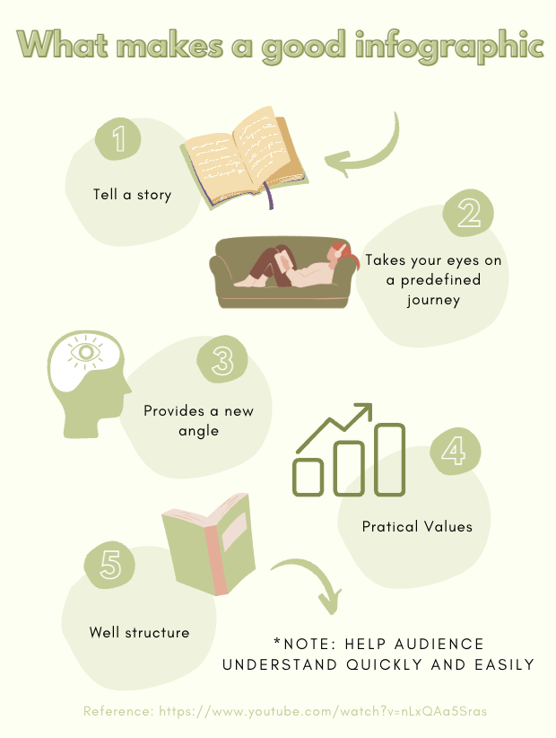
Applying a variety of design elements can make the overall picture more vivid. Still, the simplicity of the text and features is also essential. On the one hand, the infographic focuses on the important points of the story. It is not a newspaper that people need to spend much time reading words. On the other hand, Design elements complement the text, not be a comic book illustration. Too many design elements can steal the limelight from the text.
Reference
Visme. (2019). Marketing color psychology: what do colors mean and how do they affect consumers? . Retrieved from: https://www.youtube.com/watch?v=x0smq5ljlf4